Recently I worked on projects where I had to customize the standard graph elements to create an engaging experience on the consumer portal. In this post, I will be sharing my experience with Salesforce data visualization and charting.
Default Charts offered by Salesforce
Before getting into the custom charts, I want to spend a quick minute summarizing the standard Charts/Graphs that come with Salesforce. If you have worked with Salesforce charts then you probably already know that most default charts are pretty much the same as what you get with Excel and can be plugged into a Dashboard fairly easily (just like excel charts). Following are the default charts offered by Salesforce:
- Horizontal Bar Charts
- Vertical Bar Charts
- Line Charts
- Pie Charts
- Donut Charts
- Funnel Charts
- Scatter Charts
For definitions and prescribed usage you can visit: https://help.salesforce.com/help/doc/en/chart_types.htm
Custom Charts
If you are not happy with the default charts, you can create your own custom charts. However, creating charts from scratch requires substantial scripting work. It can be a pain in the b***t to ensure that the charts work fine on different browsers. I recommend customizing standard charts offered by other provides. Try some of the JS based charts that can be customized in the Visualforce environment.
There are plenty of options available online. Unfortunately, most are paid. I liked the objects offered by JQchart, primarily because they are FREE! jqChart takes advantage of HTML5 Canvas to deliver high performance client-side charts and graphs across browsers (IE 6+, Firefox, Chrome, Opera, Safari) and devices, including iOS and Android mobile devices. As full disclosure, I don’t get paid by jqChart. :).
Here are a couple of sample charts from jqChart that I used for our custom work. To these graphs, we made some functional and visual changes.
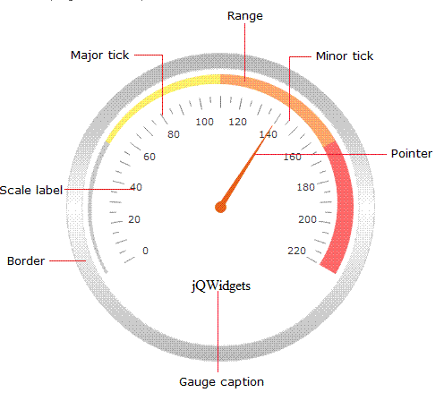
jqChart
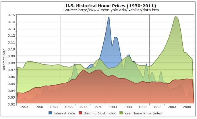
Custom Charts Built from Scratch
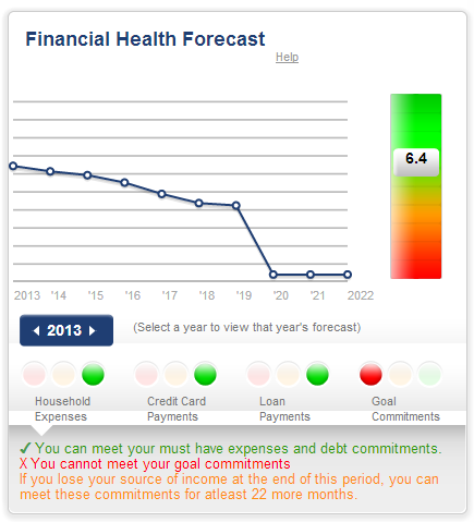
The following are the examples of other charts that my colleagues built from scratch for our financial planning product. As I said before, we spent a lot on time making sure that these graphs worked fine on different browsers. So I don’t recommend building Salesforce Charts from scratch unless you have no other option.

Salesforce.com chart customization.
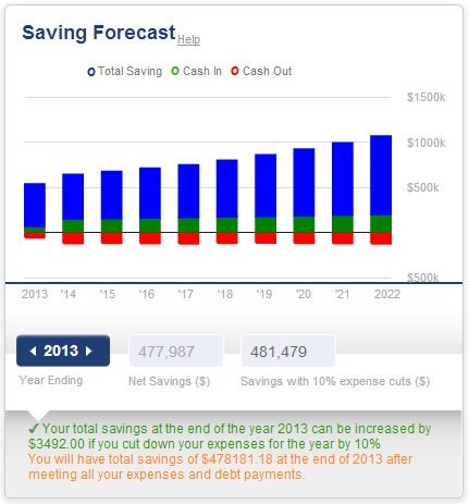
Stacked Columns
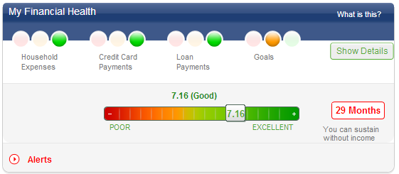
Custom Bar
Combo of Vertical Bar and Line Chart
I hope that this information helps. Share this blog with others who may find it useful. Feel free to reach out to me if you have any questions or ideas for me.
cheers
Pramod
Leave A Comment